Ravanshenasline
Online therapy web app connecting clients with experienced psychologists, with web design and digital marketing focused on trust and easy session booking.
Web Design → Digital Marketing
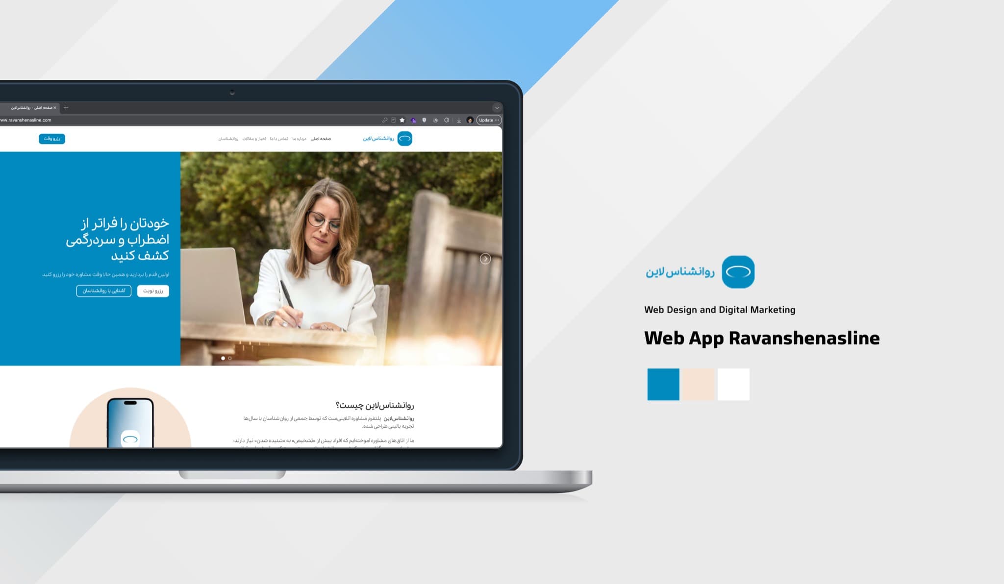
Online therapy web app connecting clients with experienced psychologists, with web design and digital marketing focused on trust and easy session booking.
What Was Delivered
- 01Web DesignResponsive website design and development
- 02Digital MarketingSEO, campaigns, and online growth strategy
A palette with a purpose
For an online therapy platform the palette has to lower anxiety before anyone reads a word. A calm, clear blue carries trust, a warm sand softens it and keeps it human, and generous white gives every screen room to breathe.
Primary · 60%
Calm Blue
#018ABE · RGB 1, 138, 190
Trust, clarity and calm, the colour most associated with safety and professional care.
Secondary · 30%
Warm Sand
#F6E3D4 · RGB 246, 227, 212
Warmth and empathy; it balances the cool blue with something soft and personal.
Space · 10%
Open White
#FFFFFF · RGB 255, 255, 255
Breathing room that keeps profiles, sessions and booking quiet and readable.
The mark
A soft, open ring sits above the Persian wordmark: at once an eye that listens, a speech bubble and a safe space. Its gentle gradient keeps the mark light rather than clinical, and the rounded letterforms carry the same calm.


RoyaCo